
Design Brief: Retrospect III - A(nother) “Vintage-Inspired” Watch
OVERVIEW

Gruen Ocean Chief
Image credit: hairspring.com
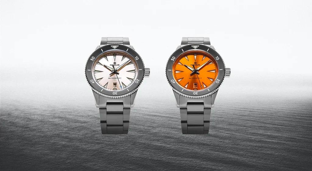
The Retrospect III is inspired by three lesser-known but highly impactful vintage watches from the likes of Gruen, Rado, and Breitling. The Gruen Ocean Chief, Rado Captain Cook, and the Breitling SuperOcean are esoteric in nature - they are rarely referenced as influential dive watches and there is not a well-documented history to study. In order to capture the spirit of the Retrospect III’s predecessors, we needed to study and embrace the spirit of the brands that made them in the time that they were made. While Breitling and Rado are well-known brands, Gruen - a now defunct brand - is typically only recognized by seasoned watch enthusiasts. Ironically, the Gruen Ocean Chief is also the original inspiration for the Retrospect project and is the one most relevant to this design brief.

Breitling Superocean
Image credit: breitling.com

Image credit: fratello.com
Gruen was an American watchmaker, as were Hamilton, Bulova, Waltham and Elgin - the latter two suffered the same fate as Gruen. Rado and Breitling are both Swiss. As the story goes, a famous speech given to investors and business partners by Dietrich Gruen - founder of Gruen watches - reflected an impassioned visionary who was driven by his audacious goals.
Dietrich Gruen had a tendency to go against the grain and his impact on the watch world can be felt even today. His emphasis on standardization laid the groundwork for the many partnerships between watch brands, which was rare for the time and is still rare today. In fact, Gruen and Alpina - a Swiss maker - also eventually collaborated on a dual-branded project to help Gruen grow their European market and help Alpina grow their US market. Gruen’s work on standardizing the supply chain also probably helps explain why three separate brands may have created watches that shared the same quirky feature: an inward-sloping bezel.
Gruen believed that “with machinery and large-scale production, watches lost their personality.” While they had become “fairly efficient,” they lacked character. One of the key distinctions between Gruen and other makers - as described by Gruen themselves - is that “after the machines have done their part, Gruen watches are finished by the finest hand workmanship” - an ideal that Nodus has come to embrace, by bringing our final assembly and regulation back to the US with highly-trained technicians.
In “A Worthy Company of Watchmakers,” a book put out by the Gruen Watch Company in 1918, watchmaking is described as an “art and a mystery” - it is an art because of the dedication of the watchmakers when designing and assembling each watch, and it is a mystery because the secrets of the trade were - and still are - closely guarded. We agree that watchmaking is, at least in part, an artform; but we hope that this brief will start to reveal the mysteries of how a modern independent watch company operates.
REFERENCE MATERIAL
Case

In its first iterations, the Retrospect was as tall as 14.5mm!
The Retrospect III wears significantly thinner due to reduced height and added chamfers.
Earlier iterations of the Retrospect wore very tall on the wrist. Over time, as tastes changed and our supply chain evolved, we slimmed the case down. In addition to getting the case down to 13mm with the crystal, we also added a chamfer to the bottom of the case to add an illusion of additional thinness.
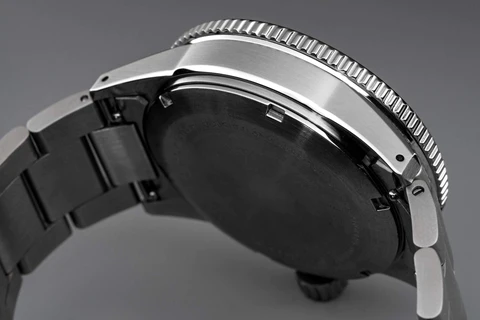
Bezel
The Gruen Ocean Chief and Breitling SuperOcean were released in the mid-1950s. It isn’t clear which came first, but they certainly shared some curious similarities. One of the striking features that they share is the inward-sloping concave bezel. Due to its nebulous history, it is not immediately clear why this was done. However, over time it became apparent that an inward-sloping bezel provided additional scratch protectIion for the bezel markings, as they were not as exposed to impact, thus keeping the markers clear and legible for much longer than other dive watches.
Looking at samples of watches that utilized the more orthodox convex bezel shape, it seemed that over a long period of time, concave bezels maintained their condition better than their convex counterparts - especially considering that due to inferior manufacturing capabilities, the alloys used for bezel inserts were softer and more prone to breakage.

70 years later, many vintage Gruen divers still look to be in relatively good shape.
The wideness of the bezel is really what gives this watch its signature feel - almost dinner plate-like. It also shields the crown from impact.
As to why three brands embraced and shared such a quirky design element for their own models - we will probably never know for sure. But writings from Gruen’s book state that their watches were “standard machine made, but hand finished,” implying that the different models from different brands could have been derived from common tooling.
Indices
Another quirk that is curiously shared by two of the three reference watches was the prominent dials that had long or triangular indices. Again, it is unclear why the designers opted to go in this direction, but it gives the watches a unique and aggressive aesthetic.

DESIGN OBJECTIVES
Bezel
The essence of this watch is in the shape and size of the bezel in proportion to the dial and case. In order to bring the design up to date, the proportions are made to be less extreme, the lume is brighter and longer-lasting, and the bezel material is greatly improved. Additionally, the bezel action has sharp and snappy clicks, but feels smooth and glidey at the same time, unlike the original friction bezel.
Date Window
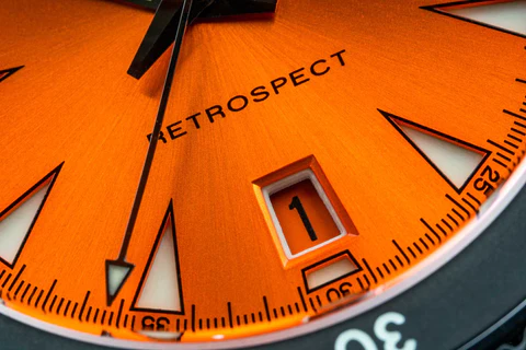
The lumed date window aids with orientation in dark environments.
The trapezoidal date window has become a Nodus signature since being first introduced on the Retrospect II in 2019. The lumed frame aids with orientation at night, while the color-matched wheel is pantone-matched with the dial to blend seamlessly into the overall design.
Indices
Unlike the references, which had printed and/or applied indices, the Retrospect III utilizes a sandwich-style construction, which allows more luminous application for dark-environment legibility. We kept the triangle motif, but leaned into the aggressive nature that they exude by making them longer, wider, and sharper.

TECHNICAL CHALLENGES
Bezel Insert
In previous iterations of the Retrospect, we have used steel and ceramic inserts. For this version, we opted for DLC coated steel inserts for increased durability and a utilitarian appearance. The inserts are blasted before they are coated to give it a flat matte finish. During production of this version, we had a challenge with lume application - more specifically, applying the "4" on the bezel insert was challenging due to lume overflow (see below). In order to solve this problem, we modified the typeface to make it less bold.
Previous iterations also had a thinner metal rim around the outside edge of the bezel. It was prone to dents, which became extremely noticeable on a polished surface. We enlarged the rim to prevent this issue, which also makes the watch wear slightly smaller.
Bezel Mechanism
The bezel mechanism on earlier iterations of the Retrospect has been highly praised in videos like this one and reviews like this one. Unlike the majority of modern dive watches that use click plates due to ease of installation and assembly, the Retrospect uses a finger spring assembly - a mechanism that can be found on many Rolex divers from the 90s and mid-2000s - which is more durable and has a more satisfying action. While earlier iterations may have had teething issues mostly related to the difficulty of assembly - probably why many companies have moved away from using this assembly - we have perfected our production processes and will be using this unique bezel assembly on all future Retrospects.
Similarly to Gruen, we believe that older production methods may still be used if they produce superior results, as is the case with this bezel assembly.
Dial Construction
The earlier iterations of the Retrospect had inconsistencies in the indices around the tips of each index, where the cutout was not as clean as we wanted it to be. A sharper tool and a higher-powered, more precise machine enabled us to greatly improve the accuracy and cleanliness on the edges of the indices.
CONCLUSION
Making a vintage-looking watch is not a particularly hard challenge, as the specifications are easy to replicate - but making a truly vintage-inspired watch requires a deeper understanding of the motivations of the original creators. Without an understanding of its predecessors history, it is difficult to produce a vintage-inspired watch that authentically embodies the “spirit” that Dietrich Gruen frequently alluded to - especially when the company is now defunct and its history is nebulous, at best. In trying to capture this “spirit”, we have filled in the blanks of Gruen’s history with educated guesses and extrapolations, and hope that in doing so, we have created a watch that pays due homage to its inspiration.